
Prioritized for product roadmap
Designing for the moments between bioinformatics workflows
TIMELINE
Jun – Sept 2024
ROLE
UX Designer
ORG
BioDepot & Fred Hutch Cancer Center
TOOLS
Figma, Cursor
Problem
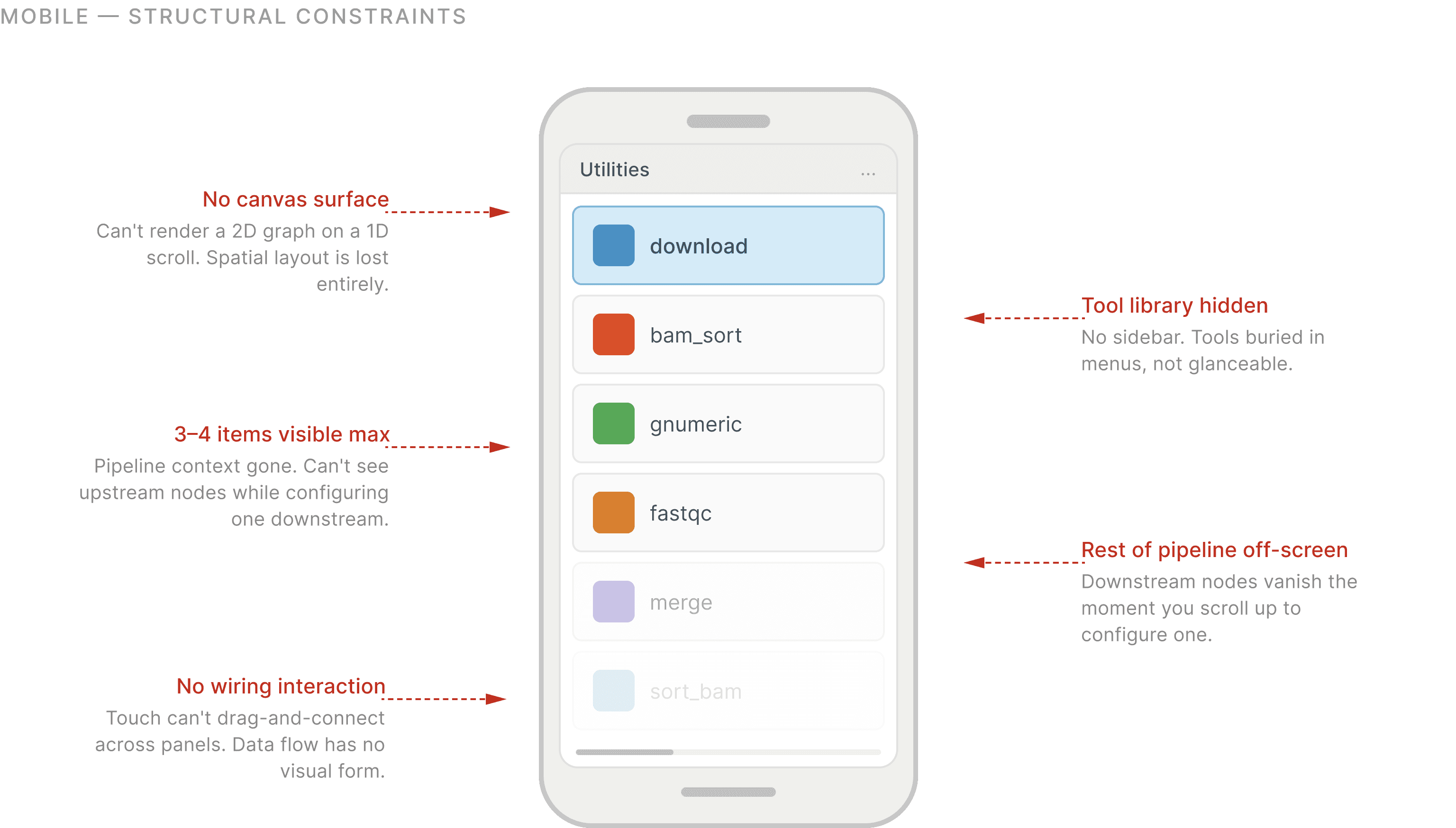
BioDepot builds desktop tools for bioinformatics workflows. They wanted it on mobile.
Researchers relied on the desktop experience for: configuring workflows, comparing outputs, managing datasets, and monitoring multiple workflow states.
These were high-focus tasks that already benefited from larger screens and dense information visibility.

Recreating the desktop experience on mobile introduced more friction than flexibility
Early conversations and explorations focused on compressing workflow-building interactions into mobile. But reducing visibility across workflow states made complex tasks harder to manage, not easier.
The problem wasn’t lack of mobility during workflow creation. It was loss of workflow continuity away from the workstation.
So we had to ask a different question.
THE OLD QUESTION
"How do we bring the desktop to mobile?"
THE REFRAME
"Why would a researcher reach for their phone instead of their computer?"
CONTEXT
Researchers lost visibility the moment they stepped away from their desks…
The work happens at microscopes, centrifuges, and benches, not at computers.
UX Implication
When the system is not available at the point of work, users create workarounds that compromise data quality and traceability.

Attention shifts constantly between samples, instruments, and people.
UX Implication
Interfaces that require linear, uninterrupted input do not match lab realities, increasing the likelihood of missing or inconsistent data.
Data gets captured on paper now, and entered into systems later.
UX Implication
UX Implication: When the system is not available at the point of work, users create workarounds that compromise data quality and traceability.

…but workflow awareness remained trapped inside the workstation.
WHY THIS MATTERS
Instead of rebuilding workflow creation itself, mobile became valuable for
sample capture
workflow monitoring
interruption recovery
status visibility
"We capture sample information during bench work and document digitally later, so there's additional documentation steps and sometimes transcription errors"
Clinical Researcher
"We move between benches, freezers, and workstations, but our workflows are mainly tied to the desktop"
Clinical Researcher
MVP WALKTHROUGH
Let's imagine you're starting a typical day in the lab
You'll receive a new sample, process it, monitor its progress alongside other active runs, and take action whenever results or alerts require your attention.
As we go through the following screens, we'll follow that same journey and see how each feature supports a different step in the workflow.
DESIGN DECISION 1
How do you understand workflow state at a glance?
It's a morning briefing. Instead of showing everything BioDepot knows, it only shows what matters right now.
Active samples. Pending QC reviews. Critical alerts. Enough information to decide where your morning begins. Nothing more.
What needs attention?
What can wait?
DESIGN DECISION 2
How do physical and digital workflows connect?
You're already standing at the bench. Walking back to your workstation just to register one sample doesn't make much sense. So the workflow begins where the researcher already is.
Are you scanning one sample?
Are you processing dozens of samples?
Rather than making barcode scanning faster, I focused on reducing everything around it. Shared defaults. Smarter forms. Fewer repeated decisions.
What is the information attached to each sample?
Anatomy of the sample page card

Mental Model
The sequencing is complete
You're walking into a discussion. Someone asks, "Can you pull up that case?" You don't need the entire desktop workflow. You need context. Fast.
Instead of organizing information around databases, I organized it around the questions researchers naturally ask.
Journey
Where is the sample?
Acknowledge Action
"Acknowledge Results." At first it was just another button. But the more we thought about it, the more it became clear that acknowledgement wasn't an action researchers repeated.
It marked the end of a review. Once acknowledged, it became part of the sample's history. Not another button waiting to be pressed.
Acknowledge Action
Flagging a case wasn't the end of a workflow. It was the beginning of one. Once a case was added for discussion, researchers returned to it. Added notes. Updated context. Prepared for conversations.

Genomics
What did we find?


Clinical
How does this fit the patient?
Reflection
Thinking through a founders lens
The challenge was deciding what not to expose. Designing how to help users move quickly without getting overwhelmed.
The workflow rarely broke in one dramatic moment
Limiting controls reduced friction, but the experience still needed to feel powerful enough for experimentation teams.