
OPTIMIZELY • SHIPPED 2025
Simplifying A/B testing for first-time users
TIMELINE
Jun – Sept 2024
ROLE
UX Designer
TEAM
PM, Design, Research
TOOLS
Figma, Cursor
Variant Editing Architecture
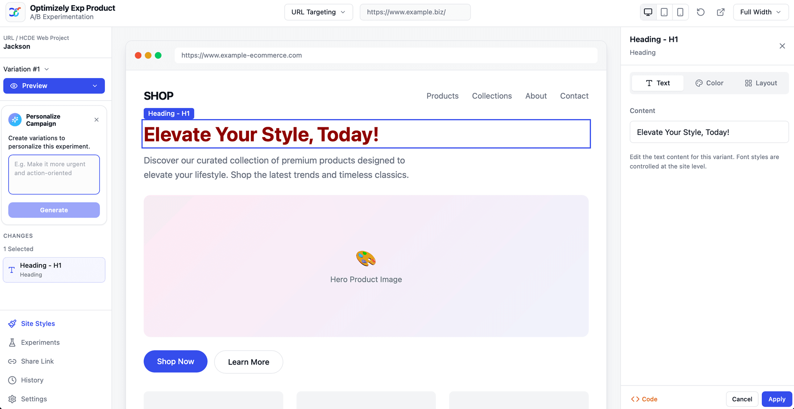
i redesigned Optimizely’s variant editing workflow so first-time marketers and product teams could select, edit, and review webpage changes without needing to understand selectors, html, or css
bEFORE
AFTER

CONTEXT
Optimizely was scaling their A/B testing market, but numbers showed first-time users struggle
Optimizely’s Web Experimentation product helps teams run A/B tests on live websites. However, many users struggle to launch their first experiment. Editing an experiment required thinking like a developer. It didn't scale to their expanding market.
Growth teams
Product managers
Marketing teams
Problem
How people think about experiments vs create them..
While the platform supports powerful testing workflows, creating a variant often required working through code, identifying selectors, editing HTML, and managing styles, all within the same flow.
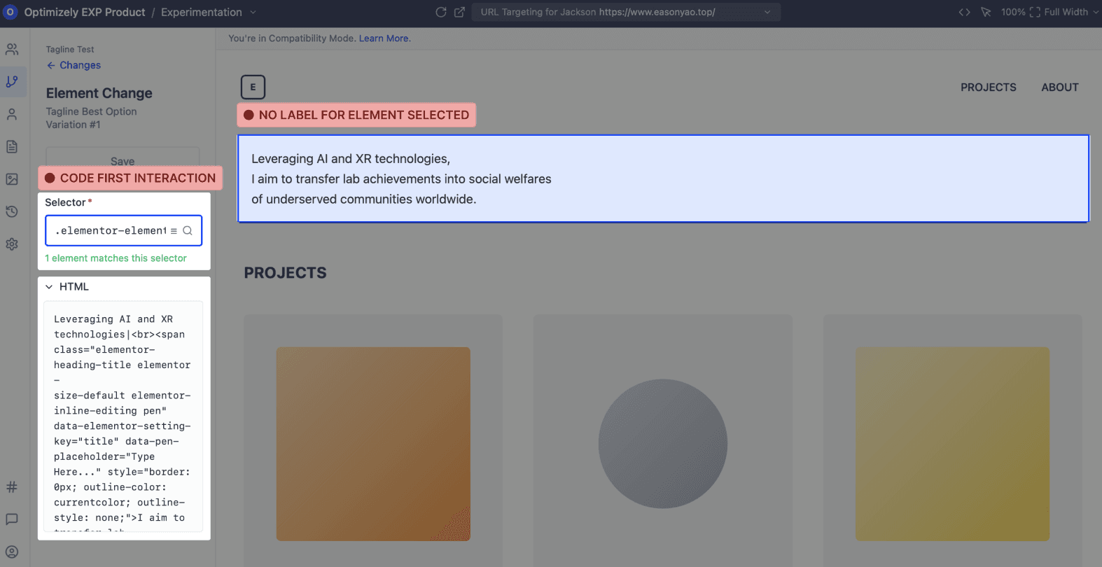
...especially first time marketers who were not fluent in code!
"I see code and my brain panics! Can I just edit how I would on no-code website builders?"
Product Manager
"What is a selector? Does this help make my job easier? For somebody non-tech like me it would be good to give some hints."
Marketer
WHY THIS MATTERS
If running experiments requires developer involvement, teams,
Run fewer experiments
Iterate slower
Delay product learning
"I wanted to try a few versions quickly, but I spent more time figuring out the workflow first."
Product Manager
"We move fastest when we can test ideas as soon as we have them."
UX Strategist
"We had ideas ready to test, but not always the momentum to set them up."
Marketer
So, lowering the technical barrier could allow more teams across an organization to run experiments independently.
THE NEXT BIG QUESTION
What did reducing technical barrier mean? What did control mean for the different user groups conducting A/B tests for the first time?
UNDERSTANDING THE WORKFLOW
Experiments meant quick, focused edits, not full redesigns..

..so the editor needed to allow for fast iteration, not unlimited control.
Instead of exposing every styling and code control upfront, the editor guided users toward selecting elements directly on the page and editing only what mattered in context.
SO WHAT DID I DO?
I learnt that control meant different things for different first-time users depending on their background. But most users, did not come from a technical background.
To balance both, I re-designed variant editing experience to reduce friction while still enabling flexibility.
Mental Model
I organized the experience around a simple guided editing workflow
Users start by orienting themselves through optional support (history of changes, AI prompts, experiment context), then move into the canvas to select elements directly on the page. From there, they refine those selections through structured controls for text, images, and layout, making changes that are immediately visible and easy to iterate on.


By grounding the design in this three-part system (Support → Select → Control), I created a clear sense of where users are in the editing process while keeping the complexity of experimentation approachable, fast, and intuitive.
Iterations
Three levels of exploration for editing workflow:

Direct Manipulation
This is what the UI looked like when I first joined the early project.

Notes driven UI
Exploratory chat UI introduced as an overlay on the note canvas.

Structured properties panel
Synthesizes learnings into a scalable and adaptive layout.
VARIANT Editing Flow
The design prioritizes a tight select-edit loop, while keeping guidance and advanced tools available without getting in the way

Hover & Select
Users interact directly with elements on the page and receive immediate visual feedback and confirmation on what elements are being selected

Edit
The visual editing canvas, users select any element on the page and modify it without touching code & receive immediate visual feedback, keeping editing grounded in real context
Edit text
Edit color
Edit layout
Editing with code for advanced users

Support
Every modification is tracked in real-time, giving users full visibility and confidence in the edits they've made.
View selected elements
View active change history
REDUCING IDEATION FRICTION
Re-building and integrating Optimizely's in-built Opal (AI) for fast ideating and editing
I explored lightweight AI-assisted suggestions to help users generate variations more quickly without interrupting the editing flow.

Context-aware suggestions
Too much system interpretation before users shaped their own idea.

Guided structured input
Helpful for simple copy tasks, but too rigid for broader editing.

Blank prompt
It stayed flexible across copy, layout, and code-assisted edits.
Generating copy variations
I designed and leveraged Opal to treat copy generation as part of editing, not a separate AI workflow, so users could generate options, compare them, and apply one in place.
Exploring visual directions
Here I designed Opal to make visual exploration feel reversible and contextual, letting users try image and style directions without losing the original page.
Edge Case
Some changes needed to work across the entire site
While most experiments involved small, page-level edits, some teams needed the ability to adjust shared styles like typography, button treatments, or color systems across multiple experiences.
Instead of exposing these controls in the primary editing flow, site-level settings were separated into a dedicated space to keep everyday experimentation focused and lightweight.
IMPACT AND Reflection
How my designs helped the organization
Optimizely’s experimentation platform powers a core workflow behind 390B test impressions annually. My work helped define a scalable direction for the Variant Editor, rethinking how marketers could make experiment-specific and site-wide changes without losing visibility or control.
Making a tool easier to use didn’t mean giving users more control.
The biggest lesson was that simplifying a powerful tool does not mean removing power. It means deciding when power should appear. if every capability competes in the same moment, the user inherits the product’s complexity. The editor needed to follow the user’s sequence, not the feature list.